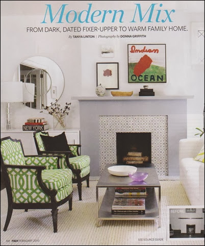
Isn’t this fireplace tile and mantle simple yet pretty? The artwork and objects add to the visual appeal. This is the home of Tanya Linton who is the director of original productions for HGTV (Canada) and a design writer. Her vibrant home is featured in the February 2010 Canadian House and Home.
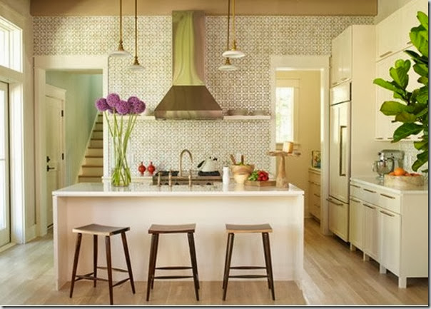
The adorable daisy tiles look very similar to the ones in this photo I posted a few weeks ago. They make a statement but the grey colour is quiet and not overwhelming.


Love that kitchen! Of course I'll add you to my blogroll!
ReplyDeletexo
Maria
I tried to subscribe to the digital version of Canadian House and Home - so many great projects featured!
ReplyDeleteI love your blog background color - it is very soothing!
Aw, thanks guys! I feel like I'm beginning to be a part of the "blog world."
ReplyDeleteYes, that's a really nice fireplace :-) The tile adds character and interest without being overwhelming. And love that shade of grey :-) The green trellis fabric on the chairs is great too!!
ReplyDeleteThank you for your sweet comment on my post about Kylie. It's been so heartwarming to read the wonderful words of support from my blogger friends, both old and new :-)
Kelly
P.S. I'm going to add your blog to our Canadian blog roll :-)
Whoops, silly me -- you ARE on our Canadian blog roll!! My brain can be a sieve sometimes!!
ReplyDeleteKelly
This colour is probably the only one I would use besides white! Loved your comments :)
ReplyDeleteThanks for all your comments! In case anyone is wondering, the colour references are regarding blog background colours which was discussed on Maria's blog a few days ago.
ReplyDelete