The movie It’s Complicated had design blogs abuzz weeks preceding its highly anticipated Christmas Day release. It is directed and written by Nancy Meyers who teamed up with set decorator Beth Rubino once again. This is the same duo that took our breath away with the gorgeous interiors of the beach house on Something’s Gotta Give.
I finally saw the movie yesterday and it doesn’t disappoint. My motive for going was to see the set decoration but I ended up loving the movie as well. The casting couldn’t have been better and the writing was the best I’ve seen for a romantic-comedy in a long while.
Quotes and photos below from Traditional Home who ran an article in their Holiday 2009 issue. Joni from the blog Cote de Texas wrote an in-depth post on the interiors of Nancy Meyers’ films. Read it here.
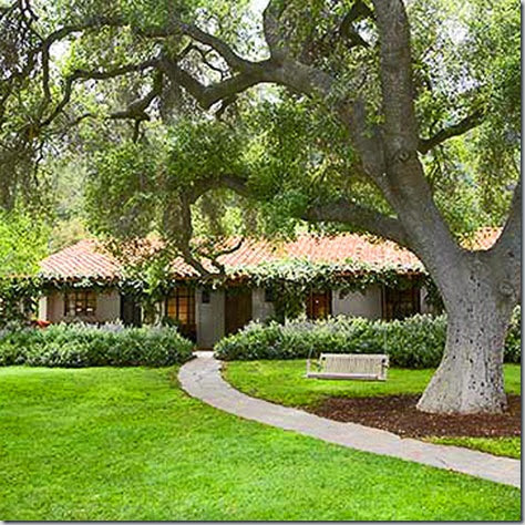
The swing informs moviegoers that the interior of the home (of Meryl Streep’s character) is relaxed, casual and unpretentious like the homeowner.
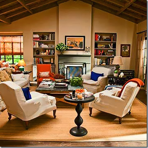
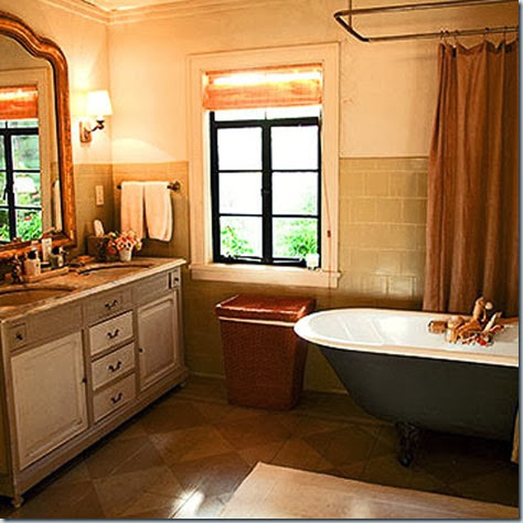
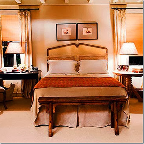
Meyers wanted the “Belgian look” as reflected in the slip-covered sofa and chairs, natural materials like linen and sisal and light wood tones like the bookcase shelves. It is casual and comfortable yet with considerable style. Orange was used as an accent color and brings life to the muted colour palette. To complement Streep's fair complexion, Meyers used "creams and beiges that would capture the beauty of her skin."
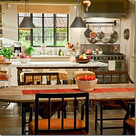
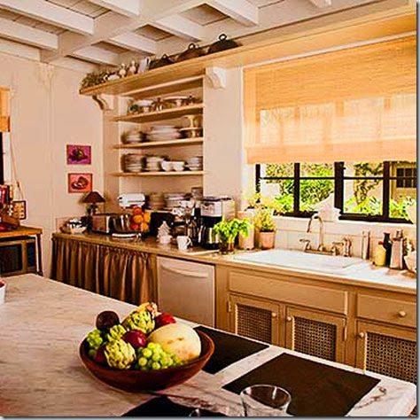
The kitchen was still charming even though Streep’s character was planning a renovation in the film. I guess we’ll have to wait for the sequel to see how it turns out!
It was Meryl Streep’s idea to display water damage on the kitchen ceiling to show how her character would live.
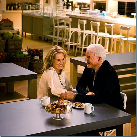
Love the bakery’s modern rustic charm.

thanks for the link! very nice of you to do that!!!
ReplyDeleteJoni
I have got to go see this movie, the still photos are so tempting!
ReplyDeleteHmmm....'modern rustic charm'. What a great description. I think that is what resonates with me lately. Modern in terms of clean lines & a certain spareness. Rustic in terms of aged materials with gorgeous patina. And charm - the decor equivalent of a great personality!
Thanks for another great post!
Your fan, CG.
Beautiful!! I'll have to take another look at the pictures on my computer at home with the bigger screen!!
ReplyDeleteI'll be at the IDS tomorrow morning too :-) Maybe we can meet somewhere :-)
Kelly
This comment has been removed by the author.
ReplyDelete