In design school, we had to develop presentation boards the old-fashioned way – gluing samples to foam core boards. I remember it always being a good day when a tile supplier or fabric showroom would give you samples to keep. You ended up with a far better project than weeding through the “retired” samples in the school’s sample room.
Fast forward 10 years and there are a few products to help decorators, designers, DIYers or anyone interested in design, put their sample boards together. One of those is Olioboard, an interactive tool to help you create your ideal space using images from their catalog or your own files.
I had heard of it for month’s but hadn’t tried it until yesterday and all I will say for now is it took me much longer than I anticipated to create the board. A sluggish computer and the learning curve probably had something to do with it. It is a pretty amazing tool and I urge you to play with it – it doesn’t cost anything. Be prepared to spend hours though!
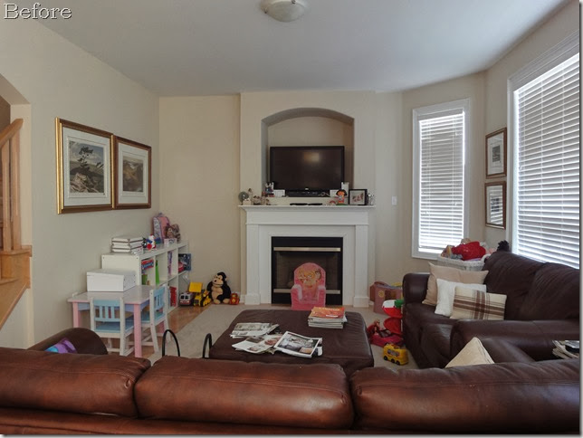
This is a photo of my client Emily’s family room that she needed design help with.

The first thing you probably notice is the niche for the TV. For some reason, builders think that niches are a good thing – they’re not! The client already knew that she wanted to drywall over it. Usually when I mention this during a design consult, the client doesn’t want to be bothered to fill in the niches. So I was quite happy when Emily already had this on her “TO DO” list.
The next question to consider is “where do you place the TV?” I have never been a fan of the TV over the fireplace – it doesn’t make design sense unless it is the only wall available for the TV. Not to mention looking up at a screen is not good for the old neck. In this case, we have that long wall where the toy storage is to place a media console.
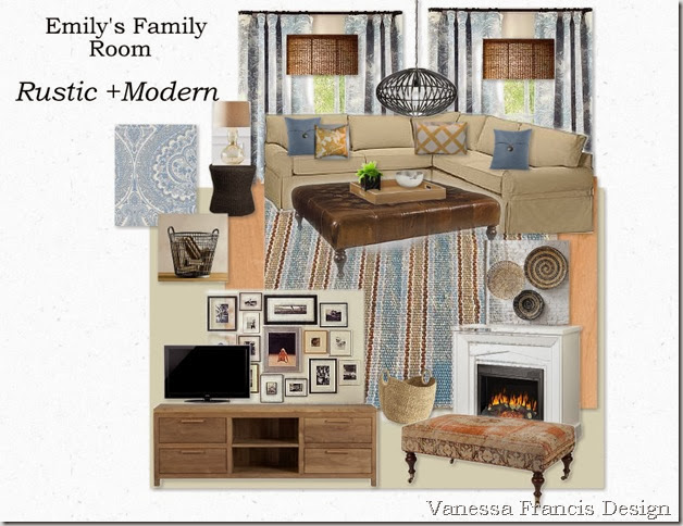
Using Olioboard, I created a design plan for Emily so that she can create the “modern country with a warm spin” (her own words) family room she desires.

1) The jumping off point was the blue paisley fabric from Tonic Living which will be used for the drapes. The drapes shown are from Pottery Barn but they look quite similar to the Tonic Living fabric (swatch on left side of board.) I have mentioned Tonic Living before and not only do they have affordable, cotton fabrics perfect for drapery but they can do the sewing as well. They are the perfect resource for the DIY client like Emily.
I would love it if Emily changed her blinds to bamboo shades but I don’t think that is in the budget for now.
I paired the blue with a deep yellow but Emily could pair it with orange or red for some interest. Just not green which isn’t her preference!
2) Emily wanted a sectional and I agreed that it would be a good use of space and provide cosy seating for her family. The one we have chosen is almost 9’ long on the section in front of the window. It is slipcovered in a light brown organic cotton canvas.
3) I love ottomans and this leather one is quite large and perfect for the size of the sectional. Rather than one person having a “chaise,” everyone can put their feet up. And who doesn’t like doing that?
4) I suggested a custom media console – very long to fill that wall. I like when TV’s are sitting on a console rather than hanging on the wall. A display of family photos and art will provide something much more interesting to look at than the traditional gold-framed prints. They wouldn’t have to be placed behind the TV as I have shown above. Room Remix has written a couple of posts on art walls around TVs.
5) Over the fireplace, I am suggesting these baskets which add texture without competing with the art wall. In front, for extra seating, could be another small rectangular ottoman covered in a kilim or other rug.
6) Toys are always an area to address when you have young kids. The media console will have storage but a container with a handle like the two I have shown (one wire and one wicker) is a quick way to stash toys.
7) With young children comes lots of spills so Emily doesn’t want to change her area rug right now. In the future, I see a striped rug like this one from Dash and Albert working well with the rustic elements. It’s made for indoor/outdoor use and is scrubbable and bleachable!
8) The natural maple hardwood will stay and the wall colour we are thinking of is C2’s Shaker –similar to what I have shown above, a warm neutral.
I know my first attempt at using Olioboard needs a little work (like the bamboo blinds in front of the drapes!) I think it’s a great tool for anyone to use to visualize their space.
What are your thoughts? Have you tried Olioboard?
If you require decorating help, please email me at vanessa@vanessafrancis.com. I would love to work with you!

I have tried Olioboard and like you I spent a great deal of time on the site. It is great tool though to give a client an idea of the feel of the space that you are designing.
ReplyDeleteVery pretty! I agree - toy storage is always an issue!
ReplyDeleteI have to play around more with it- I found it slow the first few times I tried too and I always revert back to my old powerpoint routine but these ones turn out so much better so I have to try again. Your design is beautiful- I love the palate and how warm/cozy the space it. Beautiful work!
ReplyDeleteHi Vanessa,
ReplyDeleteI like what you have done, if the room is finished as you suggested it will be a really great space for family. I agree wholeheartedly on the niche issue. Your suggestion for the television wall is perfect :) I like your colour palette too!
I have not tried this program but it seems similar to others I have found on the internet. Having enough time to go through the learning curve is always an issue.
cheers
Susan
Hi Vanessa! Great job on the Olioboard. I bet your client will be really pleased to see this visual representation of the space. Thanks for showing us the process. Would be really great to see a photo of the final result against your board :)
ReplyDeleteI haven't tried Olioboard yet, but I will! I also just signed up today for My Deco and Pinterest.
ReplyDeleteOne of my biggest decorating pet peeves is the TV above a fireplace. It's just wrong for so many reasons, the most important being it's just not comfortable to look up at a TV. It's like sitting in the front row at the movie theater.
I really like the design you came up with for Emily. The blue paisley fabric is beautiful, and the overall look is soft & warm & cozy - perfect for a family room :-)
Hi Vanessa,
ReplyDeleteYes, I tried Olioboard and agree that it is a bit time consuming -- but I do love it for creating vision boards for clients. Just need the time to do it!!!
I think your client's new family room will look fab once you are done with it. I hate niches too!!
Christine xo
Just today, I decided to use Olioboard for a client's living room. I played around a little back in the summer and dropped it and decided to pick it up again. It can really eat up time in the beginning that's for sure. Nice design btw and I agree with you and everyone else, niches and tvs over the fp are just bad design.
ReplyDeleteIntersting!. I had never heard of it. Thank you. I have just hng my drapes from Tonic Living and I am very happy with the prices and the quality.
ReplyDeleteGreat post Vanessa. I should give Olioboard another try!
ReplyDeleteNo, I haven't heard of it! I am with you and kicked it old school, glue and all!! I hope your child feels better, poor thing! You friend is very lucky to have you :)
ReplyDeleteHi Vanessa - hope your little one is ok! Yes, I have tried Olioboard and I love it. It is fun for me to use because I can create a rooms that express my design style without having to worry about a pesky budget - how awesome is that? The only downfall is that it can be super-addictive though!
ReplyDeleteThanks for all of your comments! It really is a great tool and it's free - can't beat that!
ReplyDeleteLooking good! I wish I had more time to use it!
ReplyDeleteIt looks great, especially the media console with the pictures all around. I'm sure your client loved it !
ReplyDeleteVanessa - A beautiful design...thank you so much. I love the paisley fabric. I am going to check out Tonic Living (never heard of them before...so thank you!).
ReplyDeleteThe colours are perfect...I even love the deep yellow.
We have already moved the television to the long wall (a great solution, thank you!) and wow, what a difference it makes when you're watching t.v. I had no idea how bad it was atop the fireplace until we finally moved it. The ugly niche is being drywalled next week, then paint the week after. Can't wait!
Love the wicker plates/baskets above the fireplace. Another great suggestion.
What I find most amazing about your beautiful design is that I feel you really understood the elements I was hoping for and translated them into an elevated design. Thank you so much.
I can't wait to get this room together now!
I hope your daughter is feeling better...thank you so much for this great board.
Hi Vanessa,
ReplyDeleteI also tried using Olioboard just recently, and I ended up spending an entire afternoon putting rooms together. It was a lot of fun and I can't wait to try it again with some new spaces. Next time I'm hoping to include paint colours and fabric swatches to beef it up.