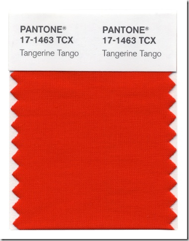
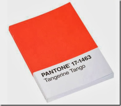
Pantone has chosen Tangerine Tango to be the colour of the year for 2012. They describe it as a “spirited reddish orange.” I alluded to it in this post.
The two samples above look totally different (on my monitor) so I think the colour ranges from what I would call a pure orange like the bottom sample to a red orange like the top.
All images via here.
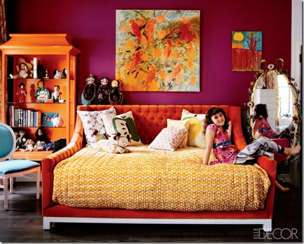
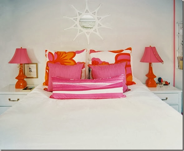
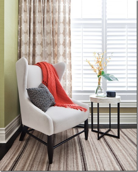
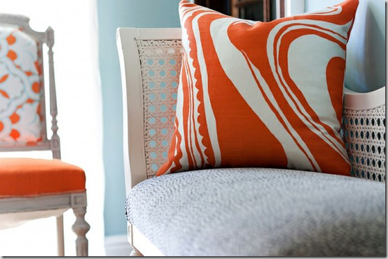
I love the idea of using Tangerine in a child’s bedroom – works well for either gender. You can also upholster some chairs in a vibrant fabric or if that’s too bold, add a throw or pillows in this hue to instantly refresh your space.
What do you think of this colour? Do you already have it in your home (and are ahead of the curve?)
Have a happy weekend everyone! Don't forgot to enter my giveaway here. I'll announce the winner on Monday.

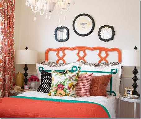
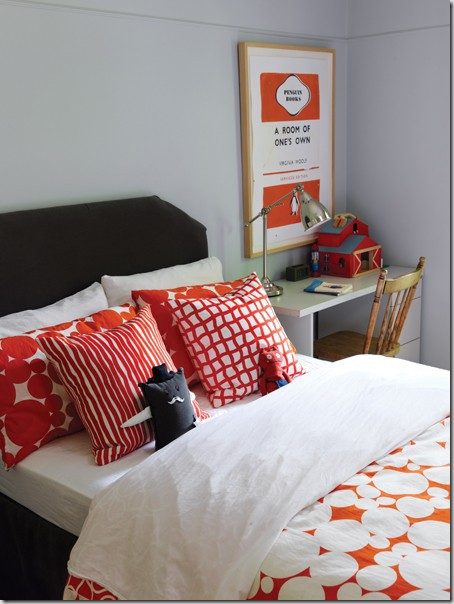
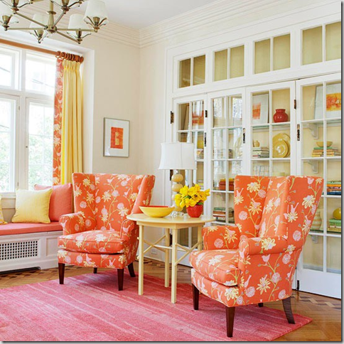
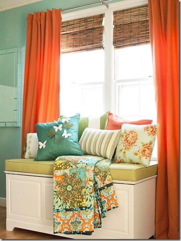
I like this colour in small doses. Funny though - I am helping a friend re-do her teenage daughter's room and she wanted a spicey orange colour. I sent her the link to Pantone's announcement and told her she was a trend setter!
ReplyDeleteI have to say, I'm not a huge fan- I just don't love orange. If it sways more pinky, than yes. And in velvet, I love a rustier version.
ReplyDeleteNever saw this color coming - I had my hopes on lavender. I haven't used this color at all and it's hard to convince clients to use it. It usually brings a strong reaction!
ReplyDeleteVanessa, You were right(in our predictions)! I think I was feeling stronger towards the Solar Power (yellow). I'm glad you posted the actual swatch color - which looks like a deeper orange-red than on the Pantone trend report (from your previous post). I love it - and think that you made a great suggestion to use Orange in a kids' room!
ReplyDeleteI'm actually happy about this! Not because I'm a trend follower, but because I've been using this colour as an accent in our master bedroom (still working on the room) and it means I'll see lots more of it in stores this year. It has been tougher to find up til now.
ReplyDeleteI think it's a really happy colour and I love how it works with blues.
Looking forward to this color trend. The decor is happy and up lifting. So many people having hard times right now financially. This does not surprise me. People need a lift!
ReplyDelete