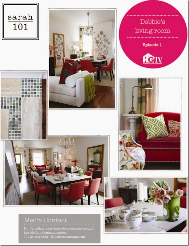
I’m sure by now you have seen or heard about the highly anticipated (especially by me) Sarah 101 which aired last night on HGTV Canada. If you haven’t watched it or don’t have access to it on the tele, you can watch it here.
There was so much information and inspiration packed into the 1/2 hour show - it could easily be an hour. As is Sarah Richardson’s usual practice, a fabric was her jumping off point for the colours and design direction for the room. In this case, it was the bold, multi-coloured floral used on the two chairs.
Some highlights/design advice from the show:
- it’s important to address the structural issues like the stucco ceiling and wood floors in disrepair before you work on the pretty
- when upholstering a sofa, use an inexpensive cotton on the body and a more luxe fabric like velvet on the seating
- loved the bold fabric on the shapely chairs and the rug covered ottoman
- a plate wall as art can be inexpensive but have maximum impact
- use of pink (pantone’s colour of the year), gold/brass (mirrors, chandelier) and medium tone wood floors are trends that we are seeing a lot of
- the fully upholstered chairs in the dining room are lovely but not practical if you have kids, unless this room isn’t used every day (the seat covers were washable though so that’s a good thing)
- the tile detail in the entry is classic Sarah – small investment/big impact
You can see more photos here and the Shopping Guide here. Sarah always shares her resources – love that about her!
In the show credits, Tommy’s role is given as “Design Sidekick.” It would be so much fun to have a Tommy to work with! You can read more about Tommy and Sarah from my meeting with them here.
Have you seen the show? What were the highlights for you?


Nice recap Vanessa! I must admit I was a bit underwhelmed by the show...maybe I was looking forward to it too much. I found it rammed with too much information and the pace way too fast, plus it needed more Tommy. Still I'll keep on watching.
ReplyDeleteWhat a colourful room for Sarah - love the plates on the wall. Thanks for posting the pictures and tips. I don't have cable so didn't get to see the show, but I'm going to check out the link you posted.
ReplyDeleteI greatly anticipated the show & was greatly disappointed. Sarah has created some extremely gorgeous rooms in past shows, but this one was a flop.
ReplyDeleteI do agree that shopping vintage is great for the budget, the environment and adding unique elements to the decor. But, those cabinets in the dining room were just tacky! (I get that the colour/pattern related to the feature fabric, but it wasn't an attractive riff on the theme.) They should have been transformed with paint!
The draperies could have been gorgeous, but were a mistake. The two fabrics made them look very skimpy. A single fabric would have looked fuller and more luxurious.....and they should have been wider, creating the appearance of larger windows, and treating the room to the greater luxury of more fabric. (Silk drapes should be interlined, and in a case like this where you're trying to fake a larger window, use heavy dim-out or black-out lining so the light doesn't shine through the fabric that falls in front of the window and expose the deception.)
I didn't find the result coherent. It looked like a lot of stuff that was chosen for price-point, not selections made to realize an idea. It seems that this series is about creating rooms on a budget. With that objective, I think that 'less is more' would have yielded a superior result......less stuff that was more carefully chosen, and not spreading the budget so thin.
I totally agree with Designwali that the show needed more Tommy. I totally love Tommy's wit, but it seemed like he had been put on a short leash, and was only allowed scripted comments that were very deferring. I like the off-the-cuff, tongue-in-cheek Tommy! Bring him back!
With Design Inc. I looked forward to being wowed every week. I really want Sarah 101 to be like that.
From,
Sarah Fan that hopes Sarah 101 gets better as the season progresses.
Hi Anon,
ReplyDeleteThank you for your detailed comment. You must be a decorator with all of your drapery knowledge! I agree that the drapes were a bit skimpy.
I don't remember the cabinets in the dining room, only the floral(?) painted one in the entry - will have to watch again for that.
I love Tommy as well but it's only a half hour show and they had to fit a lot of design advice (from Sarah) in. It really could be an hour show. Stick with it - I'm sure there will be other episodes that will 'wow you!
Thanks again for your comment!
UGH, really wish I had cable. It's going to be forever before this episodes are up on HGTV.ca.
ReplyDeleteI love Sarah but I'm a TOMMY FAN! Have you SEEN his apartment? Apt Therapy did a post a while ago (http://www.apartmenttherapy.com/boston/tommy-smythe-master-vignettes-in-torontohouse-tour-126806) but I keep referencing it! It's my go-to "boy's room." Can't wait to catch the new show, and I hope Tommy gets more input!
ReplyDeleteKatie @ Goodsy
http://goodsy.wordpress.com/