**************************************************************************************************
Hello, Lisa here. My favourite projects include unique design challenges and I love to create new ways to maximize space, while also stimulating the senses! The other favourite thing for me, is to discover a clients unspoken style and deliver a unique outcome that fits each client like a glove. It does make the portfolio look quite diverse, but it is why I love what I do so much.
This project in progress is one of my favourite in all my 11 years designing interiors. When my client said, “I want you to create a space worthy of Dwell magazine”, I was excited. When I saw that the quaint traditional condo, nestled in prime Rosedale, hadn’t been renovated in 50 years, I could barely control myself.
This is a peak at the Kitchen/Dining part of the reno. Come along as I show you how I went from “outdated Grandma” to “Dwell magazine worthy.”
Project Scope: Entire condo renovation & decoration
The client: Single, professional female in her 50’s
Before:
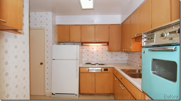
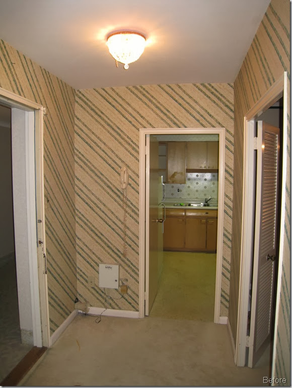
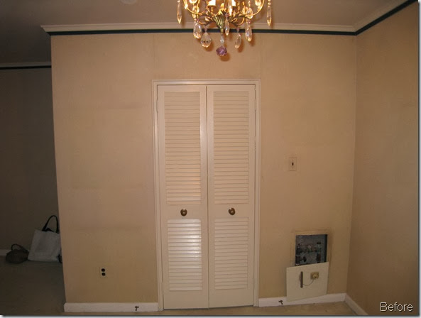
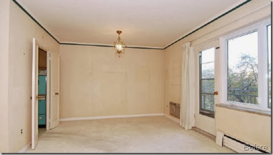
The brief:
• Minimalist modern
• Open walls as much as possible
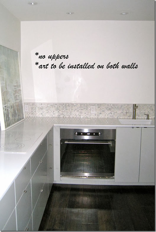
• Art instead of upper kitchen cabinets ( client loves the look and is 5’ )
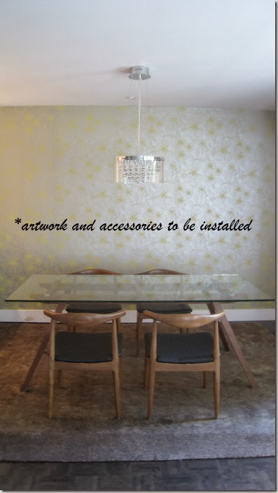
• No visible kitchen appliances from open concept dining room
The budget: Modest
The plans:
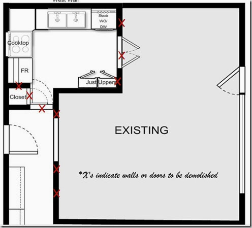
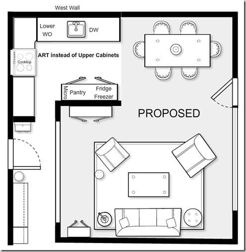
The design:
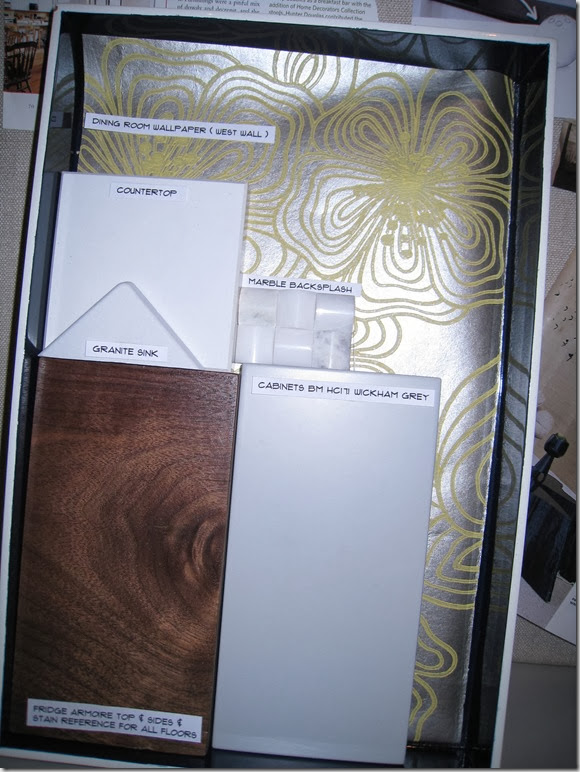
• Custom cabinets
• Integrated panel for Bosch dishwasher
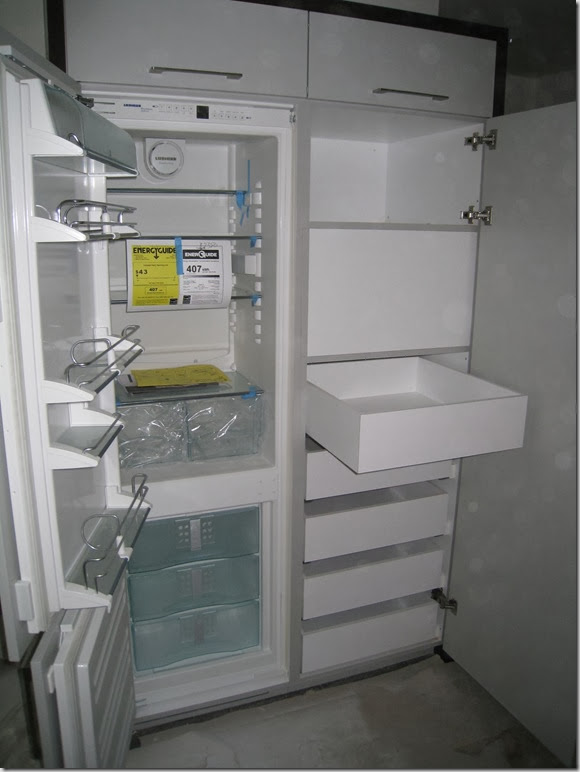
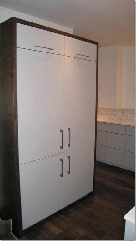
• Free standing armoire with integrated panel for Liebherr fridge/freezer, pantry & cubby for microwave (on end opposite to dining ). Scored the Liebherr in the scratch & dent section of Appliance Canada!
• Modern built in mirrored oven (Ikea Nutid) to blend in with BM HC171 Wickham Grey cabinets on discreet wall
• White minimalist GE cooktop and white Kindred granite composite under mount sink to blend in with pure white Ceasarstone counter
• Chrome minimalist faucet ( jewellery for the kitchen )
• Realistic walnut wood looking floor vinyl to blend seamlessly with new hardwood throughout
The finishes:
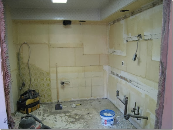
It always gets worse before it gets better!
Nearly there sneak peaks:
My new favourite interiors photographer, Brandon Barre, will be shooting the “After” very soon. I can’t wait to share more with you!
******************************************************************************************
OR you may see the full reveal in Dwell magazine (just putting it out to the Universe for you, Lisa!)
Lisa is re-launching her website this Friday: www.lisafergusoninteriordesign.com. Later this year, she will be introducing a new educational and inspirational decor brand. There is so much excitement ahead for her!
Thanks so much for sharing this Lisa. I love the idea of artwork instead of upper cabinetry. The finishes, the cabinetry colour and the gorgeous wallpaper definitely take it from Dated to Dazzling!

Wow, quite a transformation taking place there! Look forward to seeing the finals!
ReplyDeleteVanessa thank for featuring Lisa, I am so excited to see the after as well!
ReplyDeleteCome and enter my New Giveaway from Empress of the Eye. You will love it!
xoxo
Karena
Art by Karena
oh, this is going to be good - can't wait to see the reveal!!
ReplyDeleteWhat a difference!! Thanks for sharing. Where is that fabulous wallpaper from?
ReplyDeleteIncredible! Looks so lovely already! Dying to see the afters. Lisa is so great!
ReplyDeleteThank you for the kind comments!
ReplyDeleteFYI: The wallpaper is from CROWN wallpaper
Wow, this is looking amazing, I can't wait to see the final product. That wallpaper is so lovely. Thanks for sharing this project!
ReplyDeleteNancy xo
Can't wait to see the final shots! Thanks for letting us get a glimpse of your design work. I love seeing how other designers put together their boards, floorplans, etc.
ReplyDeletewow, love seeing an amazing transformation!
ReplyDeleteWow, love the finishes in the kitchen, Vanessa. Thanks for sharing the floor plans - a brilliant decision to knock down the wall and open the kitchen to an extended dining area. Really transforms the space.
ReplyDelete*Tania @ Passport2Design.com
Hi Tania,
ReplyDeleteThis design work was done by Lisa Ferguson and not by me. Not sure if you thought it was my work. Thanks!
Vanessa