******************************************************************************************
Firstly, I'm so excited to be featured on Decor Happy, one of my very favourite blogs and such a wonderful source for design and interiors inspiration. Thank you so much Vanessa for inviting me!
I thought I would use this bathroom project for my Work in Progress Wednesday post. While I don't have the professional photographs yet, I feel that this bathroom shows really well how much is involved in the design process. This project has taken several months to complete.
It is the refurb of an ensuite master bathroom for a client in South West London. The design brief was to create a classic, contemporary and luxurious space that felt like a retreat for the owners.

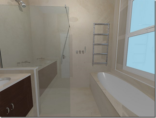
You can see from the original plans that the space was poorly laid out, not maximising the light or available space with built in partitions to create a shower which divided up the room and created a small, dark and damp cubicle and a weird angled wall for the basin (or sink as we know it in North America!) To start with, we knew that we wanted to open up the space entirely, stripping out the stud partitions, angled wall and use as much of the space and natural light as we could. My client wanted a spacious and roomy bath, a large shower and a big basin, they also wanted under floor heating, a recessed mirrored cabinet and ambient lighting.


I worked closely with a bathroom designer who created the computer generated plans and images. We deviated slightly in the final product as you can see in the final images, namely changing the specifications of the basin and towel rails but the overall layout remained the same. This was a heavily client led project and involved a great deal of work and revisions and even sketches from the client!


The owner saw a design in a magazine of a stone basin with mirrored cabinet. He snapped it on his iphone and sent it over to me and from that we recreated it with some tweaks to accommodate his specifications.

The basin looks as if it were carved from one piece of stone which would have been very expensive. In fact, this was created around a wooden frame cantilevered from the wall and is constructed with an 'apron' of stone (marble) around the wooden frame and the joints appear seamless (the stonemason did an incredible job).


The cabinet above the basin was designed by my furniture maker who also did their dressing room. We continued the American black walnut we had used for their built in wardrobes and added a bevelled mirror and recessed the cabinet into the wall above the basin so that it appears at first glance to be semi flush but is in fact 4” deep.
The Vaughan mirror lights add a touch of glamour and also contribute to the ambient lighting scheme that I designed. I used John Cullen bathroom lights which all comply with EU standards for use in wet areas. I added wall washing recessed downlighters on the back wall to create a scalloped effect on the stone and tiny recessed downlighters in the shower recesses. There are three separate circuits in the bathroom, one for the ceiling recessed downlighters which are on a dimmer, another for the ambient lighting, including the wallwashers and the recess lights and another for the cabinet lights and the LED's which are discreetly hidden in the custom made open walnut shelves above the loo.


I think we achieved what we set out to and feel it is a glamorous and sophisticated bathroom that exudes luxury. Some ways we achieved this without breaking the bank was the use of square 16” tiles rather than larger pieces of stone for tiling the floor and walls, but splurging a bit more on the bath top which is cut from one piece of stone and templated on site. We initially started out with a mid sized budget but as the scheme developed so did the budget and we were able to create something very special and bespoke which my clients are very happy with.
********************************************************************************************
Sarah, what a beautiful design! I would have felt very claustrophobic in the original shower and now the shower and bathroom are so open and airy. The use of one type of stone throughout makes it feel modern and calm. I love the design of the sink and how you described the mechanics of it. I look forward to seeing the styled photos early next year!
Thank you so much for participating in my Work in Progress series. It was a pleasure having you!

Another great Work in Progress post! What a talented lady Sarah is!
ReplyDeletenice work sarah!
ReplyDeleteThanks Vanessa! This was such a fun post, thank you for having me!
ReplyDeleteBeautiful! The sconces on the mirror are gorgeous! And what a great way to create the look of a solid stone vanity without breaking the bank.
ReplyDeleteI can totally relate to the budget expanding as the project goes along (sort of like my butt!) But so worth it in the end.
Great work, Sarah :-)
Kelly
Wow! Beautiful!
ReplyDeleteSo gorgeous!! I have to tell you that sconces mounted on a mirror is my DREAM for my own bathroom someday. It adds such glamour. This is a lovely space :)
ReplyDeleteNancy xo
I too also love the idea of sconces on a mirror...always seems so chic and sophisticated! Great job!
ReplyDeletelove this and so clever the tiles swapped for stone for a more budget-friendly option (but still achieving that look i love!)
ReplyDeleteAbsolutely love the look of that sink/basin!
ReplyDelete