I have a few talented blog friends lined up to share their projects with you in the weeks ahead.
I’m kicking off the series with with a look into a project I am currently working on. This project seems to be typical of ones that have been coming my way lately. Clients contact me because they know that something is not quite working in a room and/or they want to finish it off. This could mean swapping out furniture or adding an area rug, accessories or art.
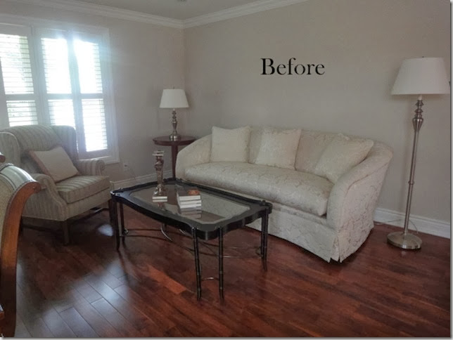
I am working with this amazing client to tweak a couple of rooms in her beautiful home. This is how her living room looked not long ago. She has a family room where the TV is located. This is more of her entertaining space. She wants to keep her sofa because it is in great condition and is excellent quality. Down the road, I can see it being reupholstered in a linen with maybe some tufting on the back.

So as you can see from the Before photo, this room is seriously lacking some je ne sais quoi (did I really write that?) This is one side of a combined living/dining room. You can see how small the room is because the dining room chair is peeking out in the left side of the photo. The only thing we are adding on the dining room side is art. She doesn’t like her dining room “set” but replacing it is not in the budget right now. I’m trying to convince her to do a series of black and whites of her travel photos to fill in the wall on the left side of the room.
I’m sure you can spot some of the trouble areas in the living room above:
- flooring which has a prominent orangey red undertone – need to make this disappear
- mismatched lamps
- chair which is out of scale with the size of the room. The other chair is sitting all by itself in a corner near the kitchen.
-lack of artwork and colour
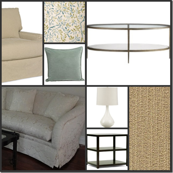
So, here’s what I have proposed. (I was trying to do this all designerish for you using Olioboard but had trouble uploading my photos.)

The wool area rug with a cotton border has already been installed and has transformed the room significantly. I did a floor plan to ensure the size of the rug was correct. I ran it throughout the entire space to unify the living and dining areas. Keeping it neutral was key as it is quite large. A pattern would have really overwhelmed the small space.
I love the smaller chairs that we chose to replace the overstuffed wing chairs. The gorgeous linen fabric is for throw cushions and for a bench which will reside under a window near the kitchen. Blue is the accent colour as it ties in with the backsplash in the kitchen which is open to this area.
You probably recognize the lamps as they are one of my favourites and I used them here. My client fell in love with them on a shopping trip even before I mentioned my love for them. The coffee table is in place and the oval shape works so well with the curve in the sofa. The lamps and coffee table are from Crate and Barrel. I can’t tell you how excited I am that a new store is opening this week only 20 minutes from me!
The dark, modern and rectangular side tables from Elte provide contrast with the traditional, curved sofa. For artwork, we went through my client’s collection and chose two paintings which were hung over the sofa.
Once everything is installed, I will share photos. So far, my client is very happy and that makes me happy too!
What do you think of this series? Informative or would you rather just see Before and Afters?
Please email me at vanessa@vanessafrancis.com whether your space needs tweaking or a complete overhaul. Would love to work with you.

This is so interesting, I love seeing the processes of other designers. I love the items you've chosen and am really excited to see the end results!
ReplyDeleteI love this series Vanessa. I like to see the process behind a redesign. And I think this room is going to look fab!
ReplyDeleteI really like the idea of seeing the progress as it unfolds. That room is going to look so improved when you are done with it and I can't wait to see the finished product!
ReplyDeleteI think this series is a great idea, and I'd love to participate :-) My dining room has been in perpetual "during" mode, so it would be the perfect candidate!
ReplyDeleteI really like the colour scheme and the pieces that you've selected. The living room is going to be lovely when it's time for its "After" pics.
We definitely HAVE to meet up at IDS this year! There's a plan in the works for dinner on the Friday. I'll keep you posted :-)
Kelly
I can't wait to see the finished product. I love seeing the design process!
ReplyDeletenice recommendations!!! thanks for stopping by my blog this morning!!!
ReplyDeleteThis is lovely, I can't wait to see how it all turns out. Having said that, I think this series is so informative and I would love to read about the process and plans behind decorating a room! Great idea Vanessa!!
ReplyDeletePS. Thank you for checking out my guest post, I really appreciate it :)
Nancy xo
This room is going to be gorgeous! I love the lamps :) xo
ReplyDeleteBring on the ideas and thoughts however they come! I love the design process!
ReplyDeleteLove going through the process! Can't wait to see what you do.
ReplyDeleteLove this! It is helpful to see a designer pick out problem areas and fix it, often I stare at rooms in my house thinking "something's off and I don't know what to do!"
ReplyDeleteI think it's a very educational series--to hear exactly why a certain piece works instead of just showing before and after pics. It gives me a peek into the design process of others. Thanks for the generosity of sharing!
ReplyDeleteGreat idea! I was wondering where the fabric is from?
ReplyDeleteOh I cannot wait to see the after photo! Looks like it will be beautiful! :)
ReplyDeleteI'm a before & after junkie! Can't wait for Wednesday's post.
ReplyDeleteChristine,
ReplyDeleteThe fabric was bought at INVU drapery in Mississuga - not sure where you are located. It is also a Duralee fabric as well.