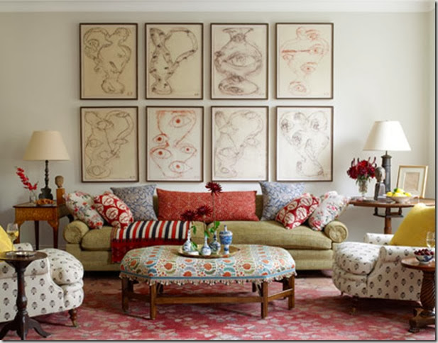
Did you see the cover of the October 2010 House Beautiful? It’s a living room designed by Daniel Sachs. I had never heard of him before but this room in a New York city apartment made me take notice.
I think if I had to show all of these fabrics to a client, they would think I was a bit nutty – but they work so beautifully together. Patterned fabrics (ikat, floral, stripes) in red, blue, green, orange, yellow – pretty well every colour of the rainbow!
This is how Sachs describes working with this client and the home: “We both love antiques, contemporary art, Indian designs, tribal textiles… The house felt collected, not decorated, like someone who has traveled a lot and picked up great artefacts and art and antiques everywhere.”
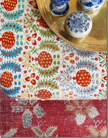
A close-up of the gorgeous ottoman fabric – a custom suzani.
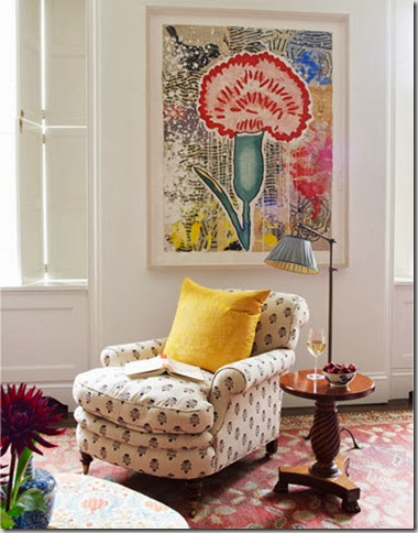
Even the floral artwork is vibrant and multi-coloured.
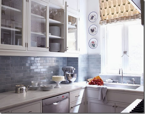
In the kitchen, a more subdued and pretty colour palette.
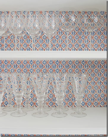
Except for the gorgeous paper from an art supply store lining the back of the cabinetry.
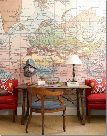
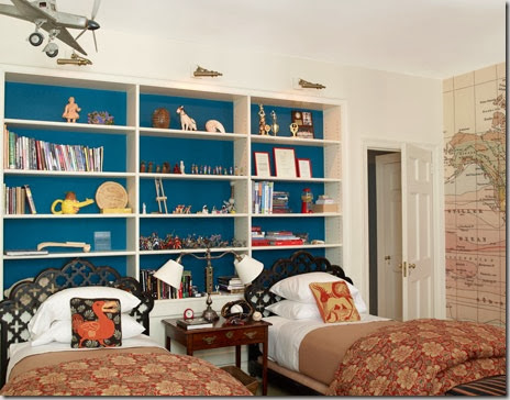
Sachs blew up a vintage map and wallpapered one wall in the boys’ room.
He used turquoise billiard fabric on the back of this built-in bookcase in the boys’ room . Isn’t he clever?
All photos from House Beautiful. Photography by Ngoc Minh Ngo.
Do you love the look of the living room? Or is it just too much colour and pattern for you?
If you need decorating help (whether you love colour and pattern or not!), please contact me at vanessa@vanessafrancis.com.

I would say I "like" the look of the living room...not quite love yet. I do like mixing colour and patterns though. And I love that blue bookcase!!
ReplyDeleteI loved this issue, and this home in particular. I would love love love a yard of that ottoman fabric. It's just gorgeous.
ReplyDeletethat ottoman fabric is amazing!
ReplyDeleteI read the article and I rather love the notion of "a book and a drink" feeling at home in a space. I think it looks super, not at all cluttered nor minimal but cozy. I think in New York City, this look tells a good story. I'd imagine coming home to a book and a drink in that space would be a welcome home. Your blog and your site are wonderful.
ReplyDeletepve
I love the ottoman in the living room. The overall look of the room with all the patterns is a bit much for me, but I do like how he's not afraid to mix different patterns -- maybe one or two less would work better for me!!
ReplyDeleteNow on to what I love -- the map wallpaper (genius!!), the bookcases with the back covered in turquoise fabric, the cabinets with the art paper, and the kitchen :-) The backsplash tiles are beautiful.
Kelly
I read this article and was drawn to the cover as well! I especially love the boys room!
ReplyDeletePersonally, I don't mind this look although I find the architecture of the room (in the first shot) a bit lacking. I was on a blog yesterday where they just lambasted this room and this issue of the magazine. I've never seen such vitriol. It definitely has people talking.
ReplyDeleteThe boys room is just awesome!
ReplyDeleteOooh! Thanks for the peak, I am still waiting for my issue to arrive, I here it's a really good one!!
ReplyDeleteNancy